Showing posts with label chart. Show all posts
November 09, 2010

Charting Halloween


According to the author:
The Graph-O’-Lantern – 6% pie, 5% Venn, 13% bar, and 100% gourd!
The description of each chart, clockwise from the upper-left:
  • Typical Witches’ Brew Composition By Weight (pie chart)
  • Known Scare Tactics Of Ghosts And Zombies (Venn diagram)
  • Vampire-Related Deaths Per Decade, Transylvania, 1960-2009 (bar graph)
June 28, 2009

Confidence That Hosting G-20 Is A Great Idea : D=90


My compliments to Indexed.


Pittsburgh: POG G20 Resistance Update #1 I liked what they wrote about You’ve Got to Show Respect to Get Respect, and I liked what they said about external fundraisers.

BailOutPeopleMovement:    (website)     (blog)     (call to action)

Protests Set for Pittsburgh (BOPM press release)


UK Wombles: See You In The Rustbelt


G-20 Term of the Day: Kettling (verb) Also known as containment or corralling. Kettling is a police tactic for the management of large crowds during demonstrations or protests. It involves the formation of large cordons of police officers who then move to contain a crowd within a limited area. Protesters are prevented from leaving the area for several hours; as a result, detainees can be denied access to food, water and toilet facilities for a long period. The ostensible aim is to leave would-be violent protesters too tired to do anything but want to go home.

P-G Headline: City could need 4,000 police officers money quote: About 10,000 officers were on duty for the London G-20 meeting in April. What's the difference?


June 23, 2009

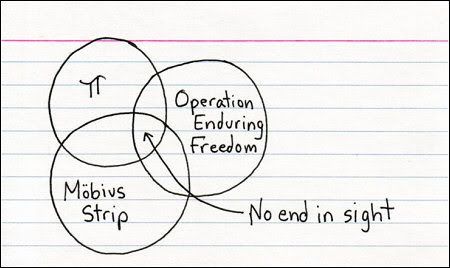
Venn Diagrams : A Chart Geek's Favorites

I've heard of Multiple Personality Disorder. If there were such a thing, I'd have Multiple Geek Syndrome (MGS). In fact, I do have MGS, but I prefer to think of it as a feature rather than a bug.

I am many kinds of geek. Info Geek. Bike Geek. Airplane Geek. Map Geek. And: Chart Geek. I really love a good chart. Let's talk charts. One of the types of charts that I like, and that translate well to the general population (a euphemism for non-chart-geeks), are Venn Diagrams.

Charts are symbolic representations of the world. They can describe complex things without many words. Charts are awesome. Sometimes, part of the trick is understanding the implications of the chart design - what it implies, what it denies, etc.


One of my favorite charts types is Venn Diagrams. Venn diagrams are exhaustive in that they show all possible intersections of various sets. Because it is difficult to depict these intersections in two dimensions, Venn's own diagrams only described the relationships of up to four sets, which he used ellipses to depict. This report uses Venn's four-ellipse-set to describe the intersection of the insect and human genome.


Subsequent work has extended Venn diagrams into four, five, and six sets. This includes the work mathematician Charles Dodgson, otherwise known as the writer Lewis Carroll, who depicted a Venn diagram of six sets.


A.W.F. Edwards created symmetrical constructions of Venn diagrams with higher numbers of sets. He projected the Venn diagram onto a sphere, depicted the intersections on the surface of the sphere, and then projected the resulting sets back to the plane to give cogwheel diagrams with increasing numbers of teeth.


Call to Action

I have not come across any photos of Venn diagram tattoos. If you've got one, please send it over. Thanks, Vannevar.


A Mathematician's Memorial

A.W.F. Edwards also designed this stained glass window commemorating John Venn, which is placed in the Hall of Gonville and Caius College at Cambridge University, England.


A Euler Diagram is a further development of Venn Diagrams, but Euler Diagrams are not required to be exhaustive; they do not need to show all possible intersections of sets, and they can show non-intersections as well.


Venn diagrams have moved beyond arcane set theory (as enjoyable and satisfying as that can be) into the sphere (sorry) of art. So let me say that understanding Venn diagrams is something to hope for, possibly even something to pray for:


Best Non-Mathematical Venn Diagram I've Ever Seen


Without further ado, I'd like to introduce the Venn diagram that I saw today, which prompted me to write this post. It's the best Venn Diagram I've ever seen. I really appreciate how he uses the nuance of the various intersections to draw out the suggested strategies.
Best Venn Diagram Ever: How To Be Happy In Business

Knowledge is Justified True Belief

Knowledge is Justified True Belief

This Venn diagram depicts Plato's epistomological assertion that "knowledge is justified true belief".


Make Your Own Venn Diagrams


If you'd like to make your own Venn Diagrams, try Venny, an online Venn-Maker.

Venn Small Amusements

(click for originals, links open in new window)


March 20, 2009

Minard's Chart of Napoleon's 1812 March to Russia : Best. Chart. Ever.

Having discussed a misleading chart in an earlier post, I'd like to write about a chart considered by many to be the best statistical chart every made: Charles Joseph Minard's chart of Napoleon's march to Moscow in his Russian campaign of 1812.


Click for larger image, opens in a new window

Beginning on the left at the Polish-Russian border, the width of the thick band shows the size of the Grande Armee at each position. The upper brown line shows the size of the army (422,000 men) as it progresses eastbound to Moscow. When the army turns around to head home, the (decreasingly wide) black ribbon shows the dwindling size of Napolean's army, which is cross-referenced to time and temperature scales. Finally, only 10,000 men return from the misadventure. The chart depicts a brutal chapter in history.

Given any time during the campaign, the chart conveys the army's direction, size, and loss relative to the start; on the retreat, the chart also conveys the timeline, position of the army, and the temperature.

From Wikipedia: Étienne-Jules Marey first called notice to this dramatic depiction of the terrible fate of Napoleon's army in the Russian campaign, saying it "defies the pen of the historian in its brutal eloquence". Edward Tufte calls it "the best statistical graphic ever drawn" and uses it as a prime example in The Visual Display of Quantitative Information. And Howard Wainer also identified this as a gem of information graphics, nominating it as the "World's Champion Graph".

I have blogged elsewhere about the notion of noticing which books a person has more than one copy of, as an indicator of the person's interests. This is a chart that I own more than one copy of, including a version from Tufte presenting the original French chart along with a recent English translation.

That the beauty, efficiency, and elegance of this chart was delivered by a human with a pen, two colors, and paper (and not anything to do with computers, chart wizards, or powerpoint) is a topic for another time.

Additional info: Tufte on Minard's sources, Minard's biography, an academic summary, and re-designs of the chart.