Showing posts with label Tufte. Show all posts
June 23, 2011

Edward Tufte's Sense of the Relevant

from today's Washington Post:

Edward Tufte, an authority on analytic design and author of The Visual Display of Quantitative Information, talks to The Washington Post's On Leadership editor Lillian Cunningham about realizing 95 percent of information is junk--and how that has sharpened his approach to any new field he pursues.


April 28, 2010

Misleading Charts: Science in Pittsburgh Schools

My pet peeve as a chart geek is misleading charts, and the most galling of these is caused by three-dimensional presentations of one-dimensional variables. Although well-intentioned, and recognizing that people are led to this offense through enabling software, the tendency to use PizZaz in Presentations results in misinformation and obfuscation.

I am led to this chartwise anal-retentiveness by Edward Tufte, who says that if you want to communicate clearly, you should study obfuscation and misdirection.

I was reading Infinonymous today and saw a chart from the City Paper, purporting to communicate the percentage of students at some Pittsburgh high schools who perform satisfactorily in science:

This chart, ostensibly intended to rapidly and easily inform the reader, misleads in many ways. Tufte would consider it an exercise in chartjunk.

First, let's talk about the use of colors. Here's a copy of the image with the numbers removed.


How do the colors influence you? Are they in a spectrum? If I were to describe the colors (Occidentally), I'd probably say:

And so, reading/scanning left-to-right (as we do), I'd say that there is a progression, and that the blue must be even better than the green. That conveys that 37% is a good score; I'm not so sure it is. There's no justification presented to make it a good score.

How does the fullness of the container influence you? I'd suggest that these values are intimated by the container's relative fullness:

The "fullness" of the right-hand bottle, for instance, suggests an accomplishment other than 37%. They're almost "all the way"! Surely the Allderdice score is not meant as the measure of maximum performance. (In fact, it's less than the state average value.)

What's with the scales on the lab flasks? We've already discussed this visually, but aren't percentages measured from 0 to 100, not 0 to 40?

What's with the linear scales on the flasks? Doesn't one inch of fluid at the bottom of the flask contain a lot more fluid than an inch at the top of the flask? What kind of flask is that, anyway?

That's an Erlenmeyer flask, thank you very much, and an inch at the bottom is a lot more volume than an inch at the top. In fact, here's a photo of the scale on the side of an accurate Erlenmeyer flask, and you can see that it's a logarithmic scale. The distance on the scale between 0 and 200ml is much different than the distance on the scale between 300 and 500ml.

The scales used in this graphic are completely misleading.


Here's the information in a table:
% of students Proficient or Better in science
WestinghousePeabodyPerryBrashearDistrict Avg.Allderdice
2.34.09.419.820.237.1


Here's a way to present the information graphically:
% of students Proficient or Better in science
Westinghouse2.3
Peabody4.0
Perry9.4
Brashear19.8
District Avg.20.2
Allderdice37.1


One problem with the above depiction is that visually, it looks like Allerdice is doing pretty well. Here's a way to present the information with a bit of context, by showing their percentage values in the context of 100 units:

% of students Proficient or Better in science
Westinghouse2.3
Peabody4.0
Perry9.4
Brashear19.8
District Avg.20.2
Allderdice37.1


The City Paper text contains an interesting datapoint: the overall Pittsburgh percentage is 20%, and Pennsylvania statewide is at 40%. That's a bit of context which would have been great at the top of the article. There's more info that I'd love to see. I'd love to see a chart or table that puts the Pittsburgh data into perspective.
  • How does Pittsburgh rate among systems in other cities with the same number of students?
  • How do Pittsburgh public schools rate against Pittsburgh Catholic schools?
  • How does Pittsburgh compare to systems that spend the same amount (per pupil) as Pittsburgh does?
Data like that in tables and accurate charts would truly be informative.
(edit: snarky exaggerated comment removed)

If this is the way the school system and the newspapers communicate data, it's no wonder that only 20% of 11th-grade students are proficient-or-better in science.
January 23, 2010

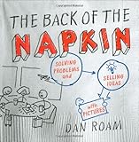
Finished: The Back of the Napkin

Finished reading "The Back of the Napkin" by Dan Roam. This book dealt with thinking visually and telling/selling through images, specifically sketches and charts drawn on Napkins.


Back of the Napkin: Visual Thinking CodexRoam presents a series of thought experiments that takes the reader through his perspective on drawing. He asks, How come in Kindergarten everybody can draw, and by 12th Grade nobody thinks they can draw? His Visual Codex provides generic examples of the type of pictures you might use in different situations, determined by the interrogatives (when where who what how why) and by a selection of five dimensions that he identifies.

napkins for drawingRoam recommends Vanity Fair Everyday napkins for drawing, but says that most any will do.

Where Edward Tufte is a minimalist and a purist, Roam is more of a generalist, more concerned with generously communicating an idea than the efficiency of how many dots are required to display meaning.

This was a very good book that I'll make use of whenever I think about how to make a conceptual presentation.
August 11, 2009

Windows 7 Upgrade Chart ReDesign

I'm not in any way a person capable of drawing, and I'm certainly no graphic artist. I have great respect for the skills of people who are. Nevertheless, I fancy myself a chart geek, I thought I'd try my hand at re-designing the Microsoft 7 Upgrade Chart.

This is my poor attempt to convey the information that the consumer needs, which I think is the answer to the question, What version of Windows 7 should I upgrade into?

My redesign of the Windows 7 Upgrade Chart


WINDOWS 7 UPGRADE CHART

  IF YOU HAVE    YOU CAN UPGRADE TO  
  OR
  32BIT TO 32BIT
  64BIT to 64BIT

  OR
  32BIT TO 32BIT
  64BIT to 64BIT

  OR
  32BIT TO 32BIT
  64BIT to 64BIT

 
  32BIT TO 32BIT
  64BIT to 64BIT
Important Notes
  • If you have Windows XP or Windows Vista Starter, you must erase all files and do a full re-install of Windows 7.
  • If you choose any combination of Vista and Windows7 other than what is shown above, you must erase all files and do a full re-install of Windows 7.


Microsoft's version of the Windows 7 Upgrade Chart


Feedback is always welcome

March 20, 2009

Minard's Chart of Napoleon's 1812 March to Russia : Best. Chart. Ever.

Having discussed a misleading chart in an earlier post, I'd like to write about a chart considered by many to be the best statistical chart every made: Charles Joseph Minard's chart of Napoleon's march to Moscow in his Russian campaign of 1812.


Click for larger image, opens in a new window

Beginning on the left at the Polish-Russian border, the width of the thick band shows the size of the Grande Armee at each position. The upper brown line shows the size of the army (422,000 men) as it progresses eastbound to Moscow. When the army turns around to head home, the (decreasingly wide) black ribbon shows the dwindling size of Napolean's army, which is cross-referenced to time and temperature scales. Finally, only 10,000 men return from the misadventure. The chart depicts a brutal chapter in history.

Given any time during the campaign, the chart conveys the army's direction, size, and loss relative to the start; on the retreat, the chart also conveys the timeline, position of the army, and the temperature.

From Wikipedia: Étienne-Jules Marey first called notice to this dramatic depiction of the terrible fate of Napoleon's army in the Russian campaign, saying it "defies the pen of the historian in its brutal eloquence". Edward Tufte calls it "the best statistical graphic ever drawn" and uses it as a prime example in The Visual Display of Quantitative Information. And Howard Wainer also identified this as a gem of information graphics, nominating it as the "World's Champion Graph".

I have blogged elsewhere about the notion of noticing which books a person has more than one copy of, as an indicator of the person's interests. This is a chart that I own more than one copy of, including a version from Tufte presenting the original French chart along with a recent English translation.

That the beauty, efficiency, and elegance of this chart was delivered by a human with a pen, two colors, and paper (and not anything to do with computers, chart wizards, or powerpoint) is a topic for another time.

Additional info: Tufte on Minard's sources, Minard's biography, an academic summary, and re-designs of the chart.
March 18, 2009

Center for American Progress Charts

I am a big fan of Edward Tufte, who is an information scientist and Yale professor. Tufte is a student of communicating (and mis-communicating) through charts. He writes about the effectiveness of charts and he critiques the effectiveness of Powerpoint. In that vein, he once testified before Congress that a factor in the launch decision leading to the Challenger disaster was a misguided reliance on Microsoft Powerpoint.

I mention Tufte because I saw a slide today from the Center for American Progress (on Der Geis's blog) that made me wish Tufte was available to critique it.

Tufte says that if we would become good communicators we must understand the techniques of willful miscommunication - for instance, to understand mass communications, the study of propagandists is informative. Tufte suggests that in visual communication nobody is better at miscommunication and misdirection than magicians, who can convince the audience through visual cues that the magician has done the impossible.

The chart I came across, from the Center for American Progress, has a bit of sleight-of-hand and I thought I'd analyze it. Here's the chart, which claims to show how different groups score on a "Progressive Index":


This chart is problematic in a few essential ways. First consider the scale of values, presented on the left and repeated below (I've rotated it to the horizontal for sake of analysis:


The scale shows a minimum value of 0 and a maximum value of 400. The two sets of crossbars are meant to communicate that the scales are discontinuous- the actual range of the displayed data is not the dramatically overbroad 0 to 400; the range of datapoints is from 160 to 247, or a range of 87 points. If charts rely on understanding specialized symbols, it's responsible to communicate the meaning to the audience rather than assume that they'll discern the meaning.

If you wanted to make a chart that communicated accurately, you'd include actual values on the axis, and you'd be explicit that the scale was not continuous - and your chart might look something more like this: (changes in red)


Tufte would say that every dot on a chart, every pixel of ink should be communicating something. If a dot is not communicating something valid then it might be an obfuscation, a magician's trick of misdirection. Look at the faint blue vertical lines connecting the data points to the names of the associated groups. Those lines are completely unnecessary; the chart could be designed with the text above and below the data points, or along the bottom axis. These lines have the effect of exaggerating the perceived visual range of the data points - in fact, the sweep of the artificially extended labels conveys that the higher datapoints are actually beyond the 0 to 400 range in the margin, when the opposite is true.

The numbers associated with the datapoints are presented in a heavier font than any other data on the chart, but they needn't be; the values should be communicated by the scale on the left. What these visually heavy datapoints, artificially displaced by the faint blue vertical lines, do accomplish is to call the eye to see the shape presented below:

Wow, there's some dramatic differences in that chart! The lower range of the visually significant shape is equivalent to a value below 0 on the scale. The upper range of the visually significant shape is well above 400, and closer to the equivalent of 500 - literally off the charts.

With a continuous axis on the left, and the datapoints shown without the exaggerating lines and labels, the chart should look something like this:

Credit (revised chart using original data values from Center for American Progress)

I must admit to a bit of bad practice of my own, in presenting the chart with a left-side scale of 0 to 400. I only used the upper bound of 400 because that's the number presented in the original chart.

When comparing the two presentations of the same data, I think that some of the techniques used in the original tend to exaggerate the differences among the groups, and the redesigned chart tends to show a fairly gentle slope and relatively modest differences between groups.


Why would anybody go to this much effort other than to advance their agenda or business case; in this situation, possibly both. The nobly-named (or perhaps Orwellian-named) Center For American Progress is a DC think tank, and like all think tanks it has an agenda, an audience, and a business goal.

November 10, 2008

Office Hacking

I'm "hacking the office" at my day job because I spend a lot of time there. If I'm going to be in there for 2000 hours a year, it should be as productive as possible. Instead of tolerating and working around annoyances, I'm going to try to dissolve them. It's "Life Hacking" at work.

My boss told me to get a white board. I think the main reason is that I've got a lot of projects going on, and if/when I get run over by a truck the next guy is going to meet a lot of surprises. I have my working info "exported" into my Franklin Planner, but I really like the white board. It's excellent for discussions where a picture is worth 1K words.

My first significant investment was to upgrade to a bigger monitor. The highly esteemed Paul Boutin wrote a Slate article, The Best Computer Update Ever, suggesting that if you already have a standard computer with sufficient memory, the upgrade most likely to increase to your productivity is a bigger monitor.

I purchased a 25.5 inch Westinghouse monitor to replace my 14 inch monitor. Although I think my buddies suspect otherwise, I paid for it myself, $500 on the Amex. I love having the real estate to see multiple windows simultaneously. The 14" was like having a great stereo with lousy speakers. It seems overly simplistic, but with the big screen I can finally see what I'm working on.

Next I followed up on the advice of 43Folders, got a label printer, and started putting paper in folders. That made a real increase in my ability to find papers. I still haven't figured out a filing system (paper or electronic).

I'm trying to become competent on the phone system, which I've been using since 1985 and I've never understood. I circulated an email asking "what do you wish you can do with the phones" to build a wish-list and as it passed around, I was surprised that somebody knew the answer to each and every wish - we had the knowledge among us, it just wasn't circulated. So now I'm able to delete voicemail without listing to the whole message, and I'm having my calls sent direct to voicemail instead of letting anybody with a phone interrupt me when I'm working. It only took me 23 years to learn the phone system.

Powers that be arranged to have a new set of office furniture delivered, so before it arrived I painted the room myself. After the furniture appeared I decided to go for an efficient computer layout and reduce the bird's nest of cables and boxes that were previously on top of my desk and table. I mounted two power-strips on the inside walls of the desk to get them off the floor. I found an $10 IKEA product that got the cables off the floor. I wanted the printer off the desk, and the PC-box itself off the desk; only work on the desk, no clutter-center boxes. So the printer and PC went under the desk.


I've got a favorite gadget: a P-Touch printer. The P-Touch printer is cool in its own right, but even more because it comes with a clipon frame that turns the printer into an (analog) picture frame. This is from somebody who gets Donald Norman's notion of emotional design: don't just build a box that sits on somebody's desk, be the product that gives them a picture of their family on their desk.


I've also built a cluster of USB devices: a DYMO label printer a card scanner, and a USB hub for memory sticks. I put in an electric stapler because I've always thought that was an over-the-top gadget. I was tempted to put in a USB missle launcher, but I think that would cross a cultural threshold of faux gravitas.


My next attempt at office hacking will be replacing the flourescent lights with full-spectrum flourescent tubes. And asking the Facilities folks to increase the flow of air from the HVAC system.

I've been reading the message board at my hero Edward Tufte's website, and one string was about the primacy of paper over other means of recording/storing/moving information. One writer talked about something I've tripped over a few times: the joy of using 11x17 inch paper. When I print reports as drafts I like to print them on 11x17 paper, with the output formated for 8.5x11, so I have the extra space to markup and doodle. Turns out there's a website dedicated to the virtue of that size called 11x17.com - where you can find all the 11x17 products you'll ever need. Aghh, I love the internet when it works like this.